


NAB
The 'Red Thread'

The red, seven pointed ‘federation’ star brandmark has been synonymous with the National Australia Bank since its inception in 1982. How do we bring it forward for a new generation?
Role
Creative Concept
Art Direction
Digital Rollout
Documentation and Testing
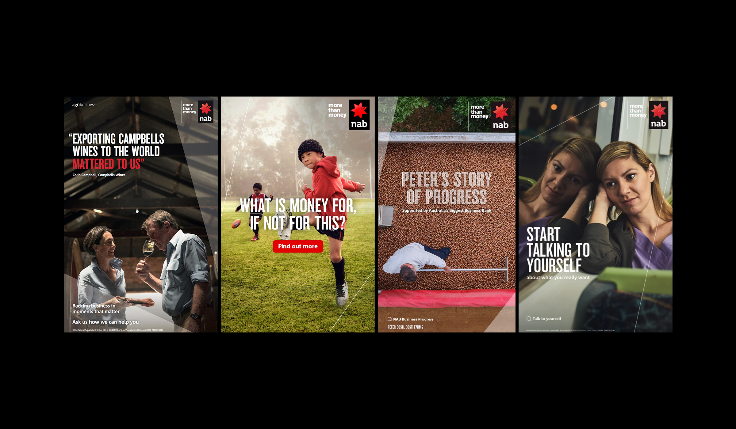
I was tasked to rethink the expression of the star marque for a new generation of digital and motion-led campaigning. The challenge was to evolve the visual expression of the NAB brand for use in tier 1, 2 and 3 communications, both online and offline, without disrupting the substantial ecosystem of existing brand livery, or diffusing the highly valuable brand equity.

The creative concept took the form of the ‘refraction’; a geometric visual element and layout device that traced the facets of the iconic star logo, enlarged and extracted them to bring dynamism and balance to creative assets across all channels.
From digital advertising, to out of home, to core customer collateral. The ‘red thread’ (as it was nicknamed internally) was used as both static visual element, and as an animated sequence to play in the more traditional star and ‘more than money’ tagline. The scale of update and application to the existing NAB brand was expansive and exhaustive, requiring dedicated online and offline brand guardians.
Additional Credits
Agency: Clemenger BBDO
Creative Team: Juan Rodriguez Cuberes


Where to now?